Spring color palettes are everywhere right now — on mood boards, in home decor stores, and all over social media feeds. But knowing which color combos actually work together is a whole different story. Whether you’re decorating a room, planning a wedding, updating your wardrobe, or designing a brand, the right spring palette can make everything feel pulled together and intentional. This list covers 21 trending combos that designers, DIYers, and creatives are reaching for this season. Each one is approachable, budget-friendly, and easy to apply in real life.
1. Lavender and Sage Green
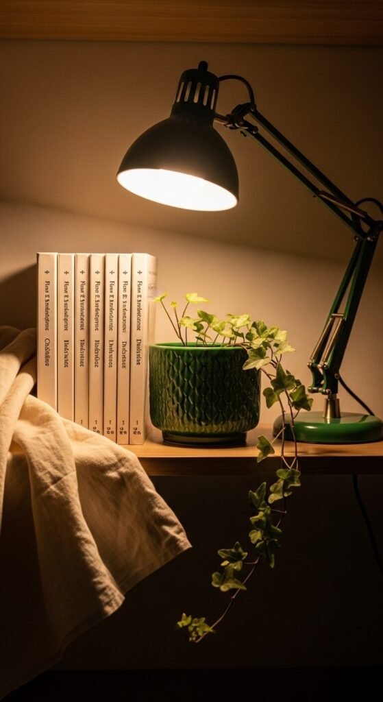
These two colors belong together. Lavender brings a soft, dreamy quality. Sage green grounds it with an earthy, calm energy. Together they feel neither too sweet nor too serious. Use this combo in a bedroom — sage walls, lavender throw pillows, and a white duvet work beautifully. For a DIY project, paint old picture frames sage and mat your prints in lavender cardstock. Budget tip: look for sage and lavender candles at dollar stores. This palette photographs incredibly well for social content too.
2. Butter Yellow and Sky Blue
This combo has a timeless, cheerful quality without feeling childish. Butter yellow is warm and inviting. Sky blue keeps things light and airy. It works well in kitchens, nurseries, and spring tablescapes. Try yellow cloth napkins with blue dinnerware for an easy, affordable refresh. In fashion, a butter yellow linen blouse paired with a sky blue tote bag is effortlessly put-together. You can pull this off without spending much — both shades are common at thrift stores right now.
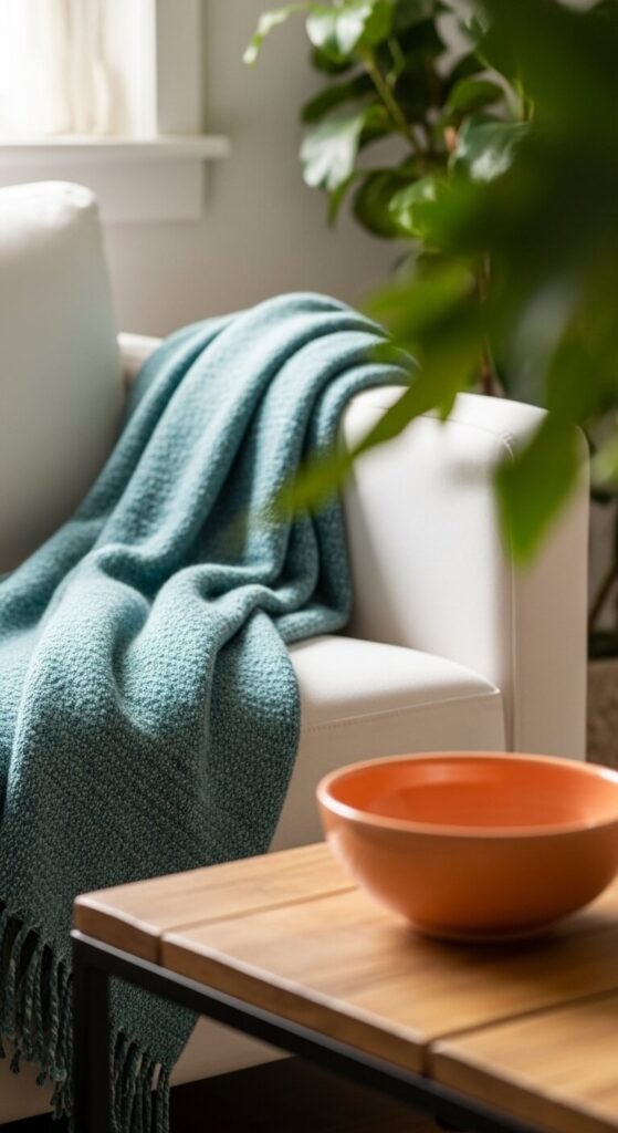
3. Peach and Terracotta
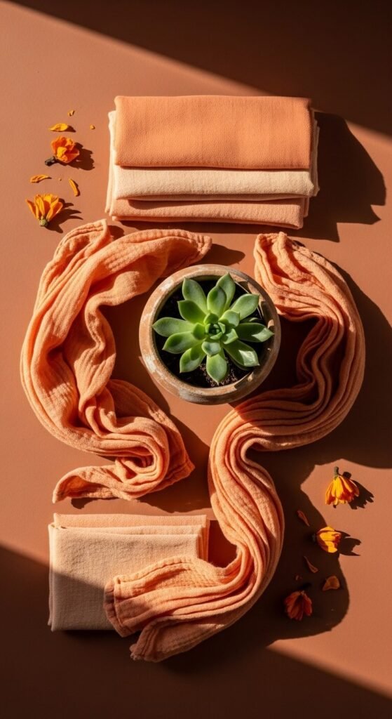
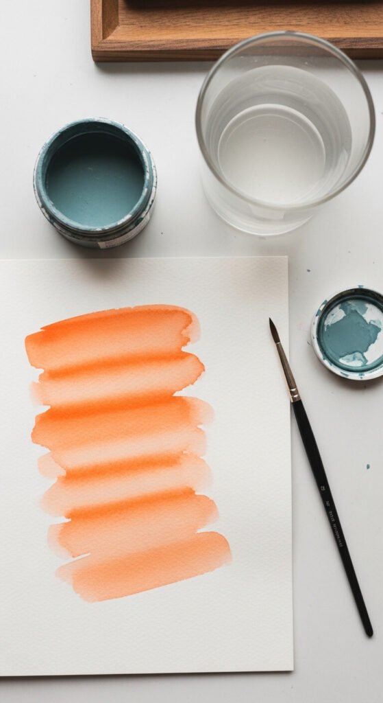
This pairing feels warm, sun-kissed, and grounded. Peach softens the intensity of terracotta, making the combination feel modern rather than rustic. It’s a go-to for bohemian interiors and earthy spring weddings. On a budget, try painting a thrifted terracotta pot and placing it beside peach-toned linen curtains. For a tablescape, use terracotta plates and peach cloth napkins tied with jute twine. Simple, low-cost, and genuinely stylish.
4. Coral and Cream
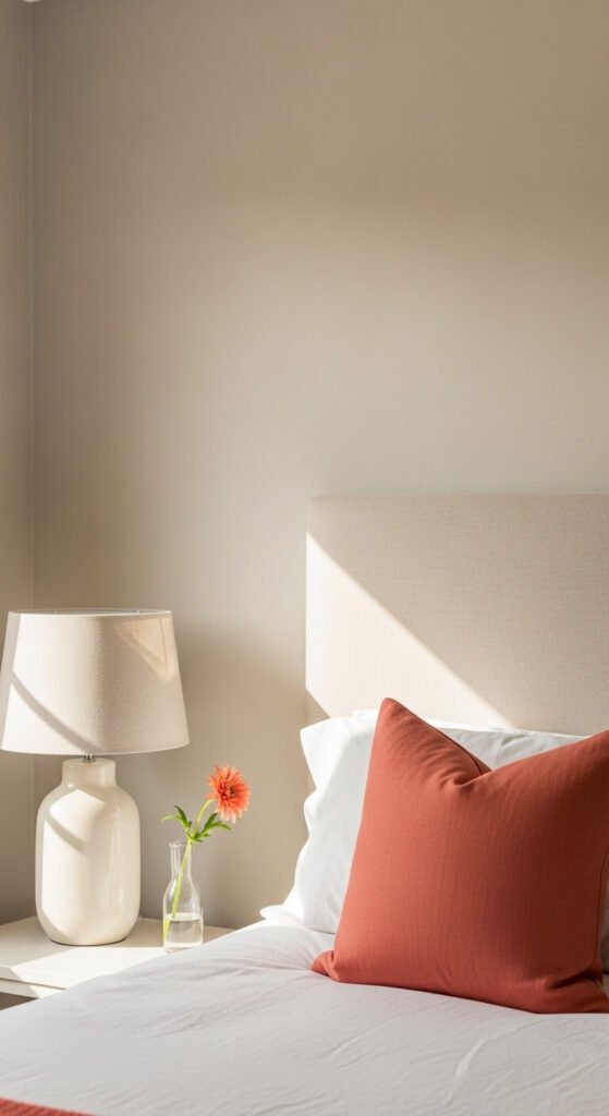
Coral is bold enough to make a statement but warm enough to stay approachable. Paired with cream, it softens into something elegant and easy. This combo works in almost any space — living rooms, bathrooms, and even home offices. For a quick DIY, wrap cream-colored candles in coral ribbon and arrange them on a wooden tray. In fashion, a coral blouse with cream wide-leg trousers is a spring outfit that photographs beautifully. Coral accessories are easy to find at budget retailers.
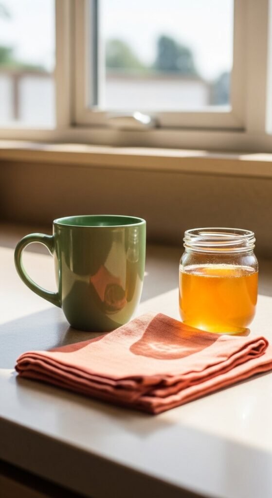
5. Mint and Gold
Mint and gold is one of the most polished combos on this list. Mint brings coolness and calm. Gold adds warmth and a little luxury — without requiring an actual luxury budget. Use mint green mason jars with gold metallic spray paint on the lids for a DIY storage set that looks high-end. In branding and graphic design, this palette reads as clean, modern, and upbeat. Pick up mint green fabric at a fabric store and pair it with gold ribbon for gift wrapping that genuinely impresses.
6. Dusty Rose and Warm White
This is one of the quietest, most livable palettes of the season. Dusty rose has just enough color to feel intentional. Warm white keeps the look clean without going cold or clinical. It works in bedrooms, bathrooms, and branding for beauty or wellness businesses. For a DIY project, dye a white linen pillowcase with dusty rose fabric dye — it’s inexpensive and the result looks custom. Pair it with warm white walls and wood tones for a complete, cohesive look.
7. Lilac and Lemon Yellow
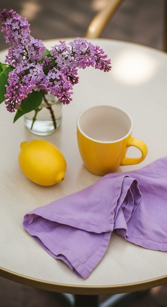
This combo sounds daring but it works. Lilac is soft and slightly romantic. Lemon yellow is sunny and energetic. Together they balance each other out. Use this pairing for a spring party — lemon yellow plates, lilac napkins, and wildflowers in a simple glass jar. In graphic design, this palette performs well for social media content aimed at younger audiences. Budget tip: both shades are common in spring tissue paper packs at dollar stores, perfect for gift bags and party decor.
8. Apricot and Soft Teal
Apricot and soft teal is an unexpected spring pairing that feels grown-up and creative. The warmth of apricot and the coolness of teal create a natural visual balance. This combo is popular in interior design right now for living rooms and reading nooks. Try apricot-toned wall art paired with a soft teal accent pillow on a neutral sofa. In fashion, an apricot wrap dress with teal earrings is a simple, affordable look that stands out.
9. Blush Pink and Olive Green
This pairing feels natural and organic. Blush pink is soft and warm. Olive green is earthy and grounding. They work especially well together in home styling and fashion. Use blush pink picture frames on an olive green accent wall for a low-cost room update. In fashion, blush and olive linen separates feel expensive without costing much. This combo also photographs well in garden settings — blush roses against olive-toned foliage look like something from a magazine spread.
10. Soft Aqua and Sand
Soft aqua and sand is the go-to palette for coastal-inspired spring styling. It’s calm, clean, and feels like a weekend morning. Use sand-toned linen with aqua glass vases for a simple shelf display. In branding, this combo reads as trustworthy and relaxed — great for wellness or travel brands. Budget tip: sand-colored burlap ribbon and aqua spray-painted mason jars make an easy, affordable spring centerpiece. This palette also works beautifully in watercolor art projects.
11. Mauve and Champagne
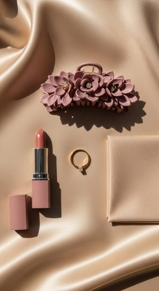
Mauve and champagne feels quietly luxurious. Mauve is a grown-up take on pink — dusty, muted, and sophisticated. Champagne adds warmth and a subtle shimmer without being loud. This combo is trending for spring weddings, bridal styling, and home decor. Use champagne-toned candles beside mauve dried flower arrangements for a centerpiece that looks expensive. In fashion, mauve and champagne silk or satin pieces are showing up everywhere and can be found affordably at chain retailers.
12. Cornflower Blue and Soft Peach
This combo feels like a spring garden in full bloom. Cornflower blue is rich and pretty without being overwhelming. Soft peach warms it up and keeps it approachable. Use cornflower blue dinnerware on a peach linen tablecloth for a spring brunch setup that takes almost no effort. In home decor, a cornflower blue ceramic vase with peach-toned dried flowers is a shelf styling trick that works in almost any room. Both colors are easy to find at affordable home stores.
13. Seafoam and Ivory
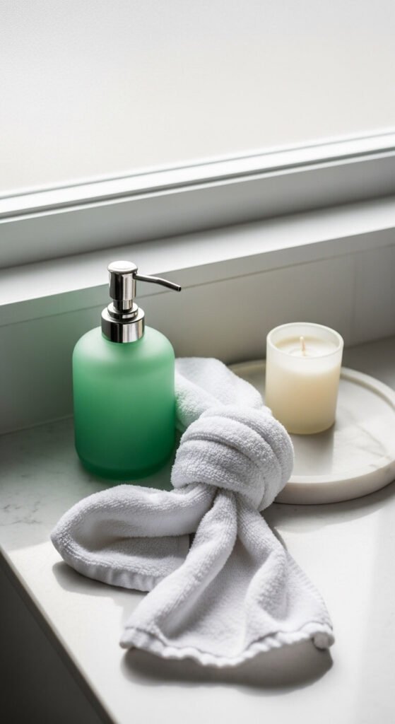
Seafoam and ivory is one of the most calming spring palettes you can use. It works beautifully in bathrooms, bedrooms, and as a branding color scheme for spa or wellness businesses. Ivory keeps things warm and earthy while seafoam adds just enough color. Try seafoam green hand towels with ivory soap dispensers for an easy bathroom update under $20. In graphic design, this palette creates an immediate sense of calm and cleanliness — perfect for health-focused brands.
14. Sunflower Yellow and Sage
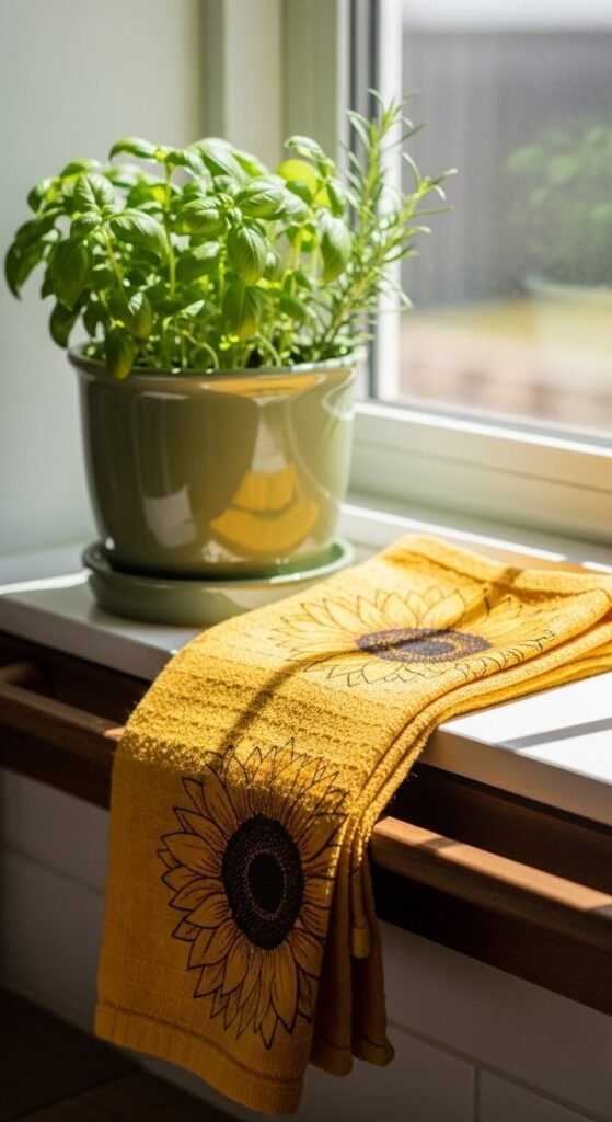
Sunflower yellow and sage is a kitchen-perfect spring combo. It’s cheerful and grounded at the same time. Use sunflower yellow dish towels and sage green potted herbs on a windowsill for an easy, affordable spring refresh that costs almost nothing. In outdoor spaces, sunflower yellow planters beside sage green garden furniture create a cohesive, intentional look. In graphic design and packaging, this combo feels organic and approachable — popular for food brands and farmers market aesthetics.
15. Dusty Blue and Blush
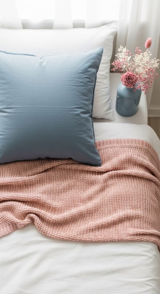
Dusty blue and blush is one of the most searched spring color combos right now — and for good reason. Both colors are muted and easy to live with. Together they feel romantic without being too feminine or sweet. This palette works in bedrooms, nurseries, and wedding design. Budget tip: pick up dusty blue and blush ribbon at a craft store to create simple, beautiful gift wrapping or table runners. This combo also looks stunning in watercolor art prints you can make at home.
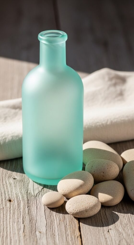
16. Emerald and Warm Cream
Emerald and warm cream is a spring palette that skips the light and pastel approach entirely. It’s bold, classic, and surprisingly easy to work with. The richness of emerald pairs naturally with the softness of warm cream. Use emerald green glass bottles with cream linen ribbons for a quick, affordable decorative display. In fashion, an emerald blazer with cream trousers is a spring power look that works for everything from brunch to job interviews. This combo photographs well under both natural and warm artificial light.
17. Periwinkle and Butter Yellow
Periwinkle and butter yellow is an underrated spring combo that’s starting to pick up serious traction. Periwinkle sits between blue and purple, making it more interesting than a basic sky blue. Butter yellow keeps the palette sunny and warm. Use periwinkle and yellow in table styling — periwinkle cloth napkins, butter yellow taper candles, and white plates. In branding, this combo reads as creative and optimistic. It’s also a great palette for hand-lettering and watercolor projects.
18. Soft Orange and Dusty Teal
This is a complementary color pairing that feels creative, earthy, and modern all at once. Soft orange is warm and inviting without being harsh. Dusty teal is cool and steady. Together they make each other look better — that’s the power of complementary colors on the color wheel. Use this combo in art projects, branding, or even outfit planning. A soft orange linen shirt with a dusty teal canvas tote bag is easy, affordable, and really striking. Interior designers are pairing these in living rooms right now.
19. Rose Gold and Nude
Rose gold and nude has staying power. It’s soft, warm, and timelessly polished. The combo works in beauty, fashion, interior design, and branding. For a DIY home decor project, spray paint small decorative objects in rose gold and display them on nude or beige linen. In fashion, nude satin shoes with rose gold jewelry is an effortlessly put-together spring look. Budget tip: rose gold spray paint is inexpensive and can transform thrift store finds into pieces that look curated and intentional.
20. Celadon and Soft Coral
Celadon and soft coral is a color pairing that feels both calming and lively. Celadon — a pale, grey-tinted green — has a quiet, ancient quality to it. Soft coral brings warmth and energy. Together they create a balanced spring palette that works in kitchens, ceramics, and surface pattern design. Try celadon green napkin rings beside coral-hued table linens for a simple, elegant spring table. In fashion, celadon linen trousers with a coral lightweight top is a complete, easy spring outfit.
21. Wisteria and Warm Sand
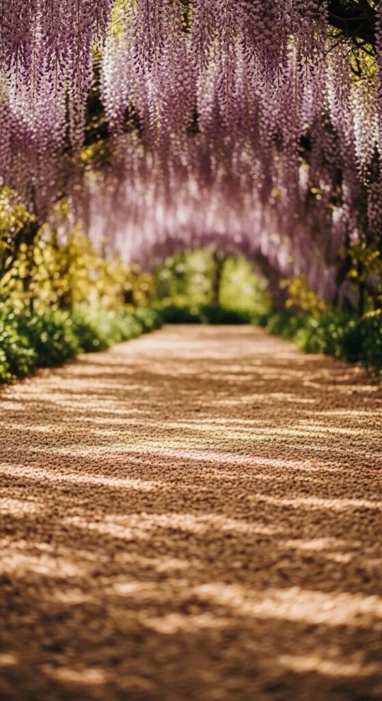
Wisteria and warm sand is one of the most atmospheric spring combos on this list. Wisteria — a soft, muted purple with violet undertones — feels romantic and a little wild. Warm sand grounds it beautifully. This palette works for outdoor event styling, romantic bedroom design, and boho fashion. Use wisteria-toned dried flowers in a warm sand-colored ceramic vase for a simple shelf moment that feels thoughtful and curated. In graphic design, this combo evokes something dreamy and organic — great for creative brands and portfolios.
Conclusion
Spring color palettes are one of the easiest, most affordable ways to bring a space, a wardrobe, or a creative project to life. You don’t need to use every combo on this list. Pick one or two that genuinely speak to you and start small — a throw pillow, a candle, a graphic design project, or even a new phone wallpaper. The right palette makes decisions easier because everything starts to fit together naturally. Use this list as a starting point, save the combinations that excite you, and let color do the heavy lifting this season.