Let’s settle this once and for all: pastel colors are not just for nurseries and Easter baskets. When done right, soft hues like blush pink, sage green, and powder blue can create some of the most sophisticated, calming spaces you’ve ever seen. The secret? It’s all about balance, texture, and knowing when to dial it up—or tone it down.
If you’ve been hesitant to embrace pastels because you’re worried your living room will end up looking like a cotton candy explosion, you’re in the right place. Let me show you exactly how to work with these dreamy shades in a way that feels grown-up, chic, and totally Instagram-worthy.

Choose Quality Over Quantity
The fastest way to make pastels feel juvenile? Overdo it. When every surface is covered in baby pink or mint green, your space starts to feel more theme park than tasteful home.
Instead, use pastels as accents rather than anchors:
- Paint one accent wall in a soft lavender instead of the entire room
- Add a single blush velvet armchair to an otherwise neutral space
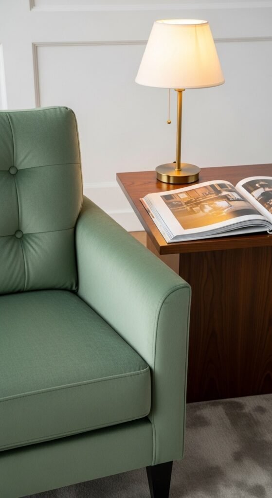
- Layer in pastel throw pillows on a charcoal gray sofa
- Display pastel ceramics on natural wood shelving
Think of pastels as the supporting actors, not the star of the show. They should enhance your space, not dominate it.
Mix With Mature Materials
Here’s the game-changer: pair your soft colors with grown-up textures and materials. This contrast is what elevates pastels from playful to polished.
Try these sophisticated combinations:
- Pale pink with black matte fixtures and hardware
- Soft blue with rich cognac leather
- Mint green with natural oak or walnut wood
- Lavender with brushed brass or aged copper
- Peachy tones with concrete or exposed brick
The roughness of industrial materials or the luxury of velvet and leather gives pastels the weight they need to feel intentional and refined. You’re creating visual tension—and that’s what makes a space interesting.
Ground Your Space With Neutrals
Pastels need a solid foundation to shine. That’s where neutrals come in—they’re the secret sauce that keeps everything from feeling too sweet.
Best neutral anchors for pastel schemes:
- Crisp white walls (the cleanest backdrop)
- Warm beige or greige for coziness
- Charcoal or deep gray for dramatic contrast
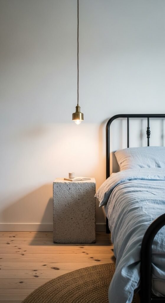
- Natural wood tones in medium to dark finishes
- Black accents for definition and edge
The 60-30-10 rule works beautifully here: 60% neutral base, 30% pastel accent color, 10% bold contrast (like black, navy, or deep green). This formula creates balance and keeps your eye moving around the room rather than getting stuck on one overwhelming color.
Add Depth With Layered Tones
Monochromatic pastel schemes can absolutely work—but only if you layer different shades and textures of the same color family.
For a sophisticated blush pink room, combine:
- Dusty rose walls
- Terracotta accent pieces
- Cream or ivory textiles
- Deep burgundy velvet cushions
This creates dimension and prevents that flat, one-note look that screams “baby’s room.” You’re working within a color story, but with enough variation to keep things visually interesting.

Choose Art and Accessories Wisely
Your decor choices will make or break a pastel palette. Skip anything with cartoon characters, obvious florals, or overly whimsical patterns.
Instead, opt for:
- Abstract art with soft color palettes
- Modern photography in muted tones
- Geometric patterns in pastel hues
- Botanical prints that feel artistic, not cutesy
- Sculptural objects in complementary pastels
The style and subject matter of your accessories matter just as much as the color. A pale pink room with abstract art and sculptural vases feels like a gallery. The same room with stuffed animals and ruffled curtains? Not so much.

Embrace Darker Accents
Don’t be afraid of contrast. In fact, darker elements are what will save your pastel scheme from looking washed out or childish.
Black window frames, charcoal throw blankets, navy accent chairs, or even dark wood furniture create the visual weight that pastels need. These deeper tones signal sophistication and prevent your space from floating away into cotton candy territory.
The bottom line? Pastels are perfectly mature when you treat them with the same design principles you’d apply to any other color: balance, contrast, quality materials, and thoughtful restraint. You don’t need to choose between calming colors and a grown-up aesthetic—you can absolutely have both.