Let’s be honest—when you hear “pastel colors,” your mind might immediately jump to nurseries and Easter baskets. But here’s the thing: pastels are having a major moment in sophisticated interior design, and they’re anything but juvenile when done right. Think blush pink velvet sofas, sage green accent walls, and buttery yellow throw pillows that make your space feel like a breath of fresh air.
The secret? It’s all about balance, texture, and knowing which shades to choose. Ready to bring those dreamy pastel hues into your home without turning it into a candy shop? Let’s dive in.
Choose the Right Pastel Shades
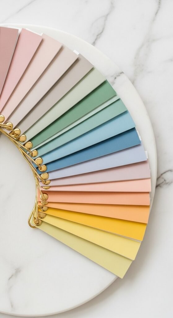
Not all pastels are created equal. The key to keeping things sophisticated is selecting muted, dusty versions rather than bright, saturated ones.
Opt for these grown-up pastel shades:
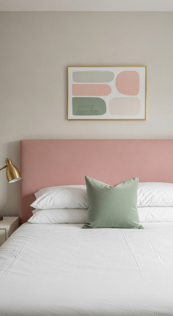
- Dusty rose or mauve instead of bubblegum pink
- Sage or eucalyptus green rather than mint
- Powder blue or slate blue over baby blue
- Warm terracotta-tinged peach instead of bright coral
- Buttery or mustard yellow rather than lemon
These deeper, more complex tones have gray or brown undertones that instantly add maturity to your palette. They whisper elegance instead of shouting playfulness.
Ground Pastels With Neutrals
Here’s where most people go wrong: they use pastels everywhere and wonder why their space looks like a sorority house. The fix? Anchor those soft hues with plenty of neutrals.
Your neutral anchors:
- Crisp white walls or trim
- Warm beige or greige for larger surfaces
- Charcoal gray for contrast
- Natural wood tones
- Black accents (yes, really!)
Think of pastels as your accent color—they should make up only 20-30% of your room’s color story. Let neutrals do the heavy lifting, and your pastels will shine without overwhelming the space.
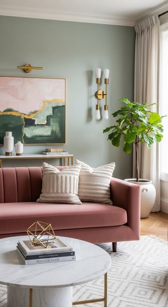
Add Sophisticated Textures and Materials
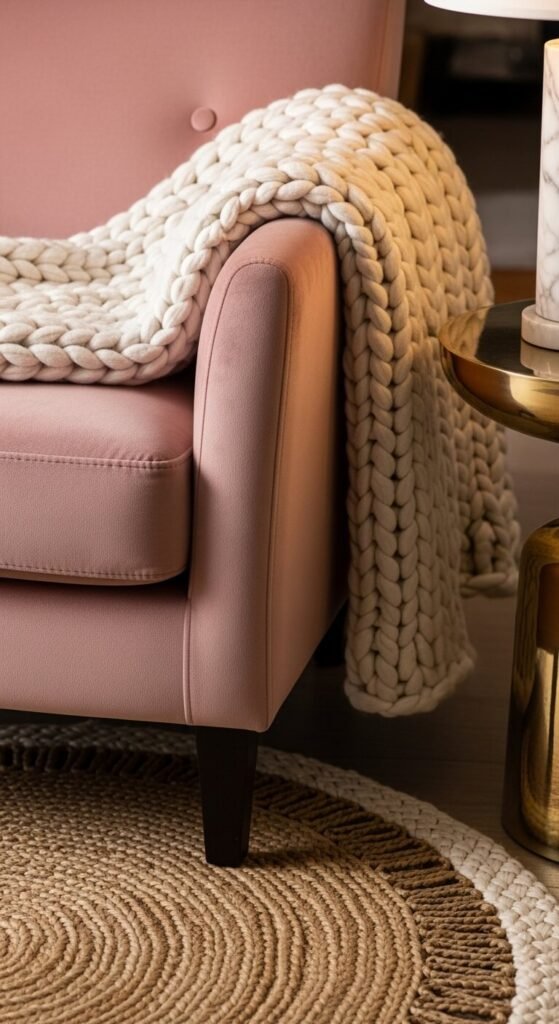
Want to know the fastest way to make pastels look expensive? Layer in luxe textures and materials. A pastel pink pillow in cheap polyester screams nursery. That same pink in linen, velvet, or silk? Pure sophistication.
Texture and material pairings that elevate pastels:
- Velvet upholstery in dusty rose or sage
- Linen curtains in soft powder blue
- Marble accessories with subtle pink or green veining
- Brass or gold hardware and fixtures
- Chunky knit throws in cream or light gray
- Natural rattan or cane furniture
These materials bring weight and substance to soft colors, creating a high-end look that feels intentional and curated.
Use Pastels as Accents, Not Anchors
One of the biggest decorating mistakes is making pastels your dominant color. Instead, use them strategically as accent pieces that add personality without taking over.
Smart ways to incorporate pastel accents:
- A single sage green accent wall while keeping other walls neutral
- Pastel throw pillows on a gray or beige sofa
- Artwork featuring soft colors in sophisticated frames
- A vintage pastel rug over hardwood floors
- Small furniture pieces like an ottoman or side chair
- Kitchen accessories like a dusty pink stand mixer or powder blue dishware
This approach gives you the softness and femininity of pastels while maintaining a mature, balanced aesthetic.
Mix Pastels With Bold Elements
Nothing says “grown-up” quite like unexpected contrasts. Don’t be afraid to pair your soft pastels with bold, edgy elements.
Try these unexpected combinations:
- Dusty pink walls with black window frames
- Sage green cabinets with matte black hardware
- Powder blue bedding with dark charcoal headboard
- Peach accents with moody navy or forest green
- Buttery yellow pillows on a leather sofa
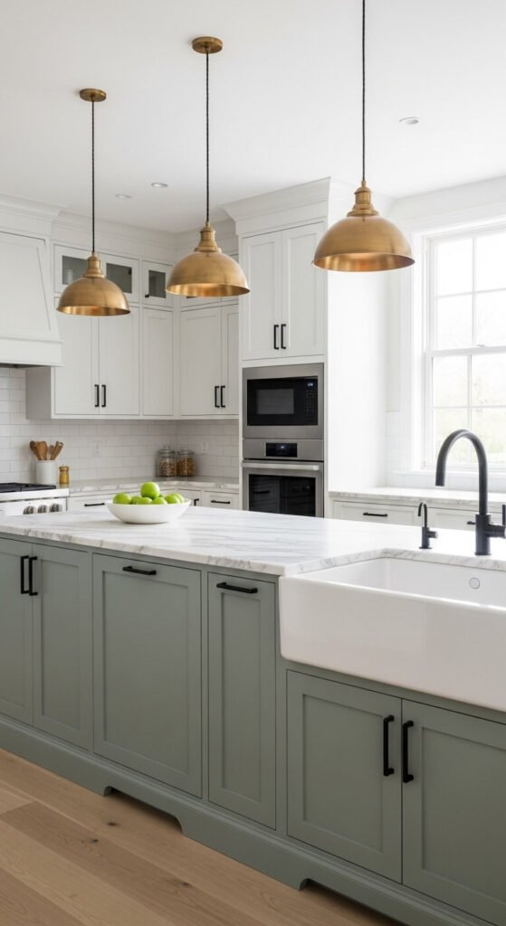
These bold pairings create visual interest and prevent your space from feeling too sweet or one-note.
Keep It Minimal and Curated
The final secret to sophisticated pastel decor? Less is more. A cluttered space filled with pastel knick-knacks will always read as childish, no matter how expensive the pieces are.
Embrace these minimalist principles:
- Choose quality over quantity—invest in a few beautiful pastel pieces
- Leave plenty of breathing room in your design
- Edit ruthlessly and remove anything that doesn’t serve the space
- Stick to a cohesive color palette (2-3 pastels max)
- Let each pastel piece shine by giving it space
Your Sophisticated Pastel Space Awaits
Decorating with pastels doesn’t mean sacrificing sophistication—it just requires a thoughtful approach. By choosing muted shades, grounding them with neutrals, incorporating luxe textures, and embracing contrast, you can create a space that feels fresh, modern, and completely grown-up.
Remember: pastels should enhance your design, not define it. When used strategically, they bring warmth, personality, and that coveted “lived-in luxury” vibe that makes a house feel like home.
Ready to give pastels a try? Start small with one accent piece and build from there. Save this guide for later, and don’t forget to share your pastel design wins with us in the comments below!