There’s something almost magical about the way spring color just works — the way soft lilac pairs with warm peach, or how sage green makes every other hue feel instantly fresher. But pulling that effortless look together in your own home, wardrobe, or design project? That’s where most of us get stuck. The secret isn’t about picking pretty colors — it’s about making them flow.
Let’s break it down, step by step.

Start With One Anchor Color
Every great spring palette begins with a single hero shade — your anchor. This is the color that sets the mood for everything else.
Ask yourself:
Do I want something soft and romantic? Think blush, lavender, or powder blue.
Do I want something fresh and natural? Try sage green, warm terracotta, or celery.
Do I want something bold but still seasonal? Reach for coral, sunflower yellow, or iris purple.
Once you’ve chosen your anchor, build outward from there. Everything else should either complement, contrast gently, or echo that base tone.
Follow the 60-30-10 Rule
This is the golden rule of color design — and it works beautifully for spring palettes.
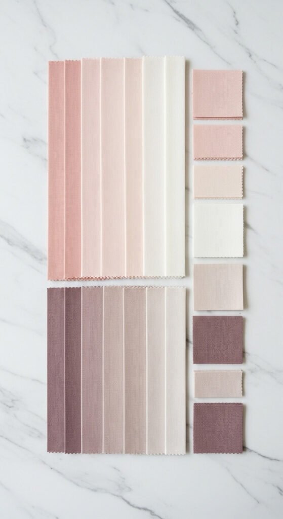
60% — Your dominant, neutral-leaning base (think warm white, cream, or light sage)
30% — Your anchor color (blush, lilac, dusty blue)
10% — Your accent pop (a deeper tone, metallic, or a contrasting hue like warm gold or terracotta)
This ratio keeps things balanced so the palette feels cohesive rather than chaotic. Spring can go overboard fast with pastels — this rule is your guardrail.
Mix Warm and Cool Tones Intentionally
One of the most common mistakes? Mixing all warm or all cool tones without any contrast. The result feels flat or one-dimensional.
Spring’s charm comes from tension — the kind you get when:
Soft lavender (cool) meets warm peach (warm)
Sage green (cool-neutral) sits beside buttercream yellow (warm)
Dusty rose (warm) anchors a palette with powder blue accents (cool)
The trick is to let one temperature lead and the other accent. You’re not going 50/50 — you’re tipping the scale intentionally.
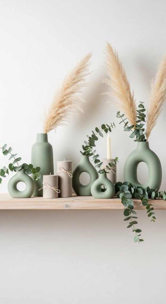
Layer Textures to Add Depth
Color isn’t the only thing that makes a palette feel alive. Texture plays a huge role in how your chosen shades read in real life.
In a spring color scheme, try layering:
Linen and cotton — matte, soft, organic
Glazed ceramics or glass — reflective, airy
Dried florals or woven rattan — earthy and grounding
When the same blush appears on a smooth wall, a nubby pillow, and a ceramic vase — it reads as three slightly different shades. That variation is what makes a palette look designed rather than matchy-matchy.
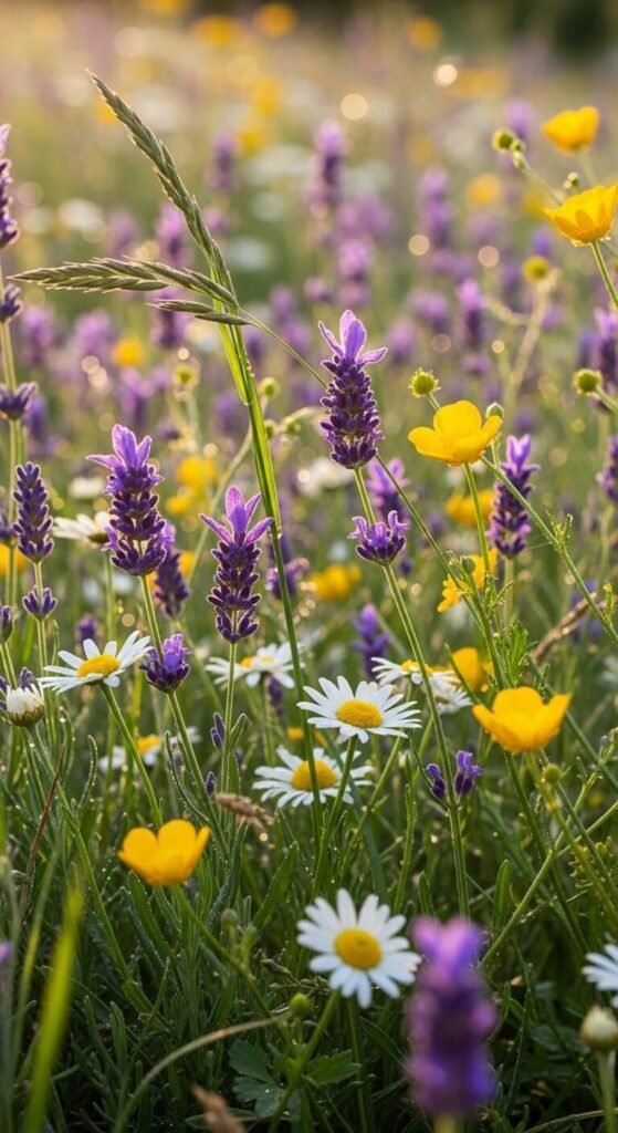
Use Nature as Your Reference Point
When in doubt, go outside. Spring’s natural palette is already perfectly balanced — it’s been working for millions of years.
Pull inspiration from:
Cherry blossom branches — soft pink, pale green, white
Wildflower meadows — lavender, gold, dusty rose, grass green
A sunrise sky — coral, peach, soft blue, cream
Take a photo, drop it into a palette tool like Coolors or Adobe Color, and let nature do the heavy lifting for you.
Test Before You Commit
Before painting a wall or buying new cushions, test your palette in the actual space or context you’re working with. Light changes everything.
Look at your swatches in morning light, afternoon light, and at night under lamps
Place colors next to each other, not in isolation
Live with your choices for at least 48 hours before deciding
What looks stunning on a mood board can feel off in real life — and vice versa!
Bring It All Together
A spring color scheme that truly flows isn’t about picking the prettiest shades — it’s about understanding how colors relate to each other and giving them room to breathe.
Start with one anchor. Follow the 60-30-10 rule. Balance your warm and cool tones. Layer in texture. And always, always let nature guide you.