There’s something about a well-placed botanical print that instantly makes a room feel alive — like the windows are thrown open and spring just walked in. Whether you’re working with a blank accent wall or a hallway that needs some love, botanical art is one of the easiest, most affordable ways to bring the outdoors inside this season.
From moody fern illustrations to delicate wildflower watercolors, the options are endless — and the styling possibilities are even better. Here’s exactly how to pull it off.
Choose the Right Style of Botanical Print
Not all botanical prints are created equal, and the style you choose sets the tone for the entire room. Think about the vibe you’re going for before you start shopping.
- Vintage scientific illustrations — Think aged paper, Latin labels, and detailed line work. Perfect for a study, reading nook, or traditional space.
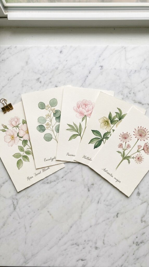
- Watercolor botanicals — Soft, dreamy, and very Pinterest-friendly. These work beautifully in bedrooms, bathrooms, and living rooms.
- Modern minimalist prints — Single stems, bold outlines, and lots of white space. Ideal for contemporary or Scandinavian-style interiors.
- Pressed flower art — Actual dried florals preserved in frames. Adds incredible texture and a handmade quality.
Stick to one style per wall or gallery grouping so everything feels cohesive rather than chaotic.
Pick a Color Palette That Works With Spring
Spring decorating is all about fresh, light energy — and your botanical prints should reflect that. Look for prints featuring:
- Sage green, eucalyptus, and olive tones
- Blush, dusty rose, or soft lavender florals
- Cream, ivory, and warm white backgrounds
- Pops of butter yellow or terracotta for warmth
Try to pull at least one color from your existing furniture or textiles so the prints feel intentional, not random. Even a simple sage green throw pillow can tie a fern print beautifully into the room.
Plan Your Wall Layout Before You Hang Anything
This is the step most people skip — and it’s the one that makes the biggest difference.
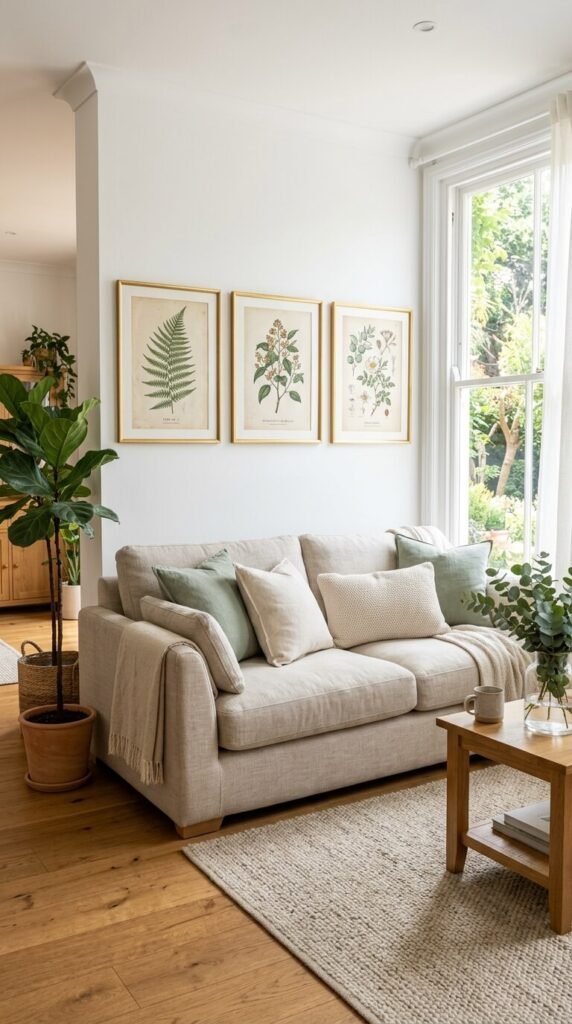
For a single statement piece: Go large. A big botanical print (24×36 or bigger) hung centered above a sofa, bed, or console table creates instant impact.
For a gallery wall: Arrange prints in odd numbers — three, five, or seven pieces tend to look more organic than even groupings. Mix different sizes but keep the frames consistent.
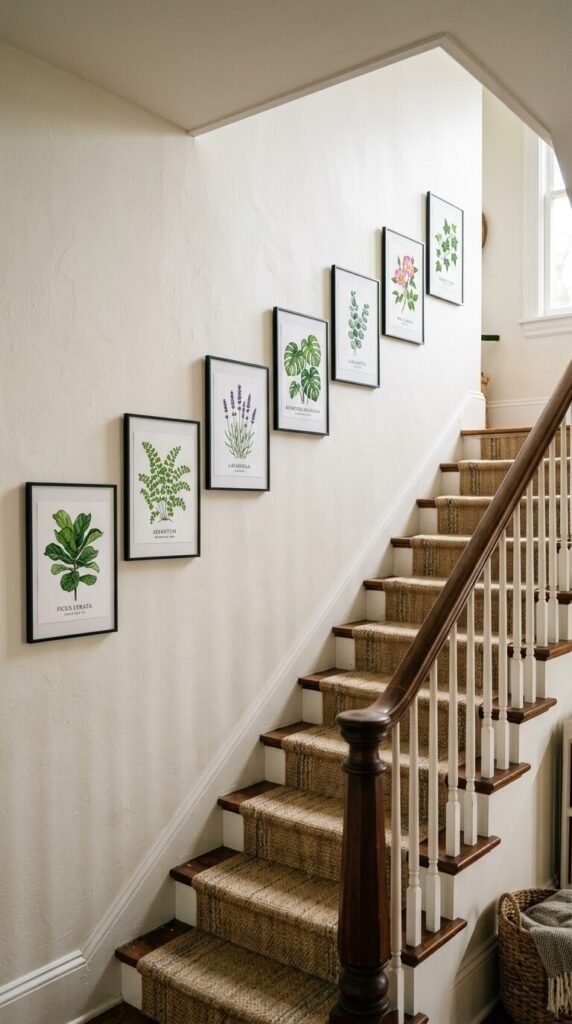
For a staircase wall: Follow the diagonal line of the stairs with a row of matching botanical frames in graduated sizes. It’s one of the most dramatic looks you can create with minimal effort.
Pro tip: Lay your arrangement out on the floor first. Trace each frame onto kraft paper, cut it out, and tape the paper templates to the wall before committing to any nail holes.
Style the Space Around Your Prints
A botanical print looks even better when the rest of the space supports it. You don’t need a full room refresh — just a few intentional touches.
- Add a small vase of fresh or dried flowers on a nearby shelf or table
- Layer in natural textures like rattan, linen, jute, or wood
- Echo the colors in the prints with a candle, a ceramic bowl, or a small plant
- Keep the surrounding décor simple so the art can breathe
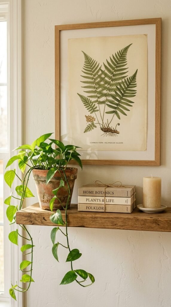
Less is genuinely more here. Let the botanicals do the talking.
Mix Prints Without It Looking Messy
The secret to mixing multiple botanical prints without it looking cluttered? Consistency in framing. You can mix ferns, florals, and foliage all day long as long as your frames match — same color, same finish, same width.
Also consider varying the orientation. A mix of portrait and landscape frames adds visual interest and keeps things from looking too rigid.
Bring Spring to Every Wall
Botanical prints are one of those rare décor choices that feel timeless in spring but honestly work year-round. Start with one or two prints, see how they transform your space, and build from there. Once you hang that first one, you’ll wonder why you waited so long.